


Did you know that different moods and feelings are created simply by the colours of the environment that we are in?

This is important to note because lots of us are in painting mode in the summer and now may be just the time to put a little thought into your colour choices around the home as you do! Let’s take a quick look at the power of colour psychology!

Home decor is often viewed as simply a matter of aesthetics — what looks attractive. But proponents of colour psychology believe that the colours you use to decorate your home can have a profound effect on the emotional well-being of you and your family.
Colour is a universal, nonverbal language, and we all intuitively know how to speak it, say experts on the use of colour in residential and industrial decor. What colour you paint your walls isn’t just a matter of aesthetics. It’s a tool that can be leveraged to affect emotions and behavior.
If you like the idea of using colour to create an emotionally healthy home, consultants say you should first consider the primary function of each room. Next, pick a predominant colour. Although it can’t be proven scientifically, colour consultants say some hues work better than others at encouraging certain activities. Need ideas? Here’s a room-by-room rundown of the shades believed to work best in each of the most important rooms of your home, and the moods they create.
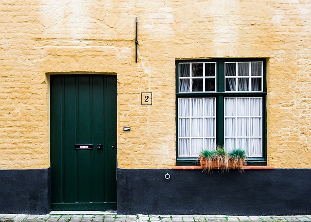
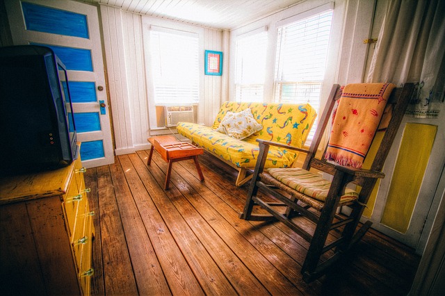
Living room and foyer paint colours. Warm tones like reds, yellows, and oranges, and earth tones like brown and beige often work well in both the living room and foyer, because they’re though to stimulate conversation. These are colors that encourage people to sit around and talk say experts because you feel the warmth and the connection with other people.
Kitchen paint colours. Colour consultants say that if you have fond memories of spending time in the kitchen when you were a kid, it might make sense to recreate the colour scheme in your grown-up kitchen. Neat idea right? But it does make sense and experts in colour are on board with this idea of recreating fond memories with colours (that is unless you had a hideous colour scheme back then…hello lime green 70’s!)
If there’s no particular paint scheme you remember fondly, reds and yellows can be great colours in the kitchen as well as in the living room and foyer. But watch out if you’re watching your weight: in addition to stimulating conversation, colour consultants say that red may prompt you to eat more. Even the restaurant industry has long recognized the appetite-stimulating power of red decor.
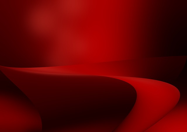
Dining room paint colours. Because it’s stimulating, red decor can be great for a formal dining room. In addition to encouraging conversation, it whets the appetites of your guests. If your dining room is red, people may actually think you are a better cook say colour experts!
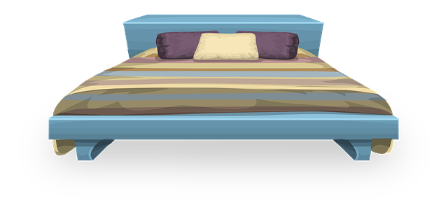
Bedroom paint colours. The bedroom is where you go to relax and reconnect with your partner. Cool colours — blues, greens and lavenders — can be great choices here, because they are thought to have a calming effect. The darker the hue, the more pronounced the effect is believed to be. Reds tend to increase blood pressure and heart rateand stimulate activity, but blue does just the opposite.
Bathroom paint colours. Whites and warm colors have always been popular choices for bathrooms, in large part because they connote cleanliness and purity. But nowadays the bathroom is used not just as a place to wash up, but also as a private retreat for relaxation and rejuvenation. Other ideas for colour schemes here may be blues and greens and turquoises because these colors give a sense of being clean and fresh — and calm.
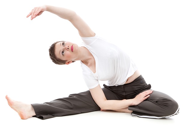
Workout room paint colours. Reds and oranges can help you move, but they can also make you feel hot. For this reason, blues and greens may be better choices here and yellow-greens and blue-greens may be the best choices because, in terms of colour psychology, they’re considered “happier”.
Home office paint colours. The name of the game here is productivity: the faster you complete work-related tasks, the more time you’ll have to spend enjoying family and friends. Colour consultants seem to come together on the choice of green as a great choice for a home office, the colour of concentration as well as a colour you can be around a long time without being irritated.
Happy home decorating! With a million choices on the menu, colour never need be boring but being mindful about it makes sense and may actually decrease the need for a re-paint job in the near future!
SOURCE: webmd.com
To receive similar content, “Like” us on Facebook @ https://www.facebook.com/niagarabuzz.ca